淺談Bootstrap中的彈出框和提示框(程式碼範例)

前言:對於Web開發人員,彈出框和提示框的使用肯定不會陌生,比如常見的表格新增和編輯功能,一般常見的主要有兩種處理方式:行內編輯和彈出框編輯。在增加使用者體驗方面,彈出框和提示框起著重要的作用,如果你的系統有一個友好的彈出提示框,自然能給使用者很好的頁面體驗。本章來看看bootstrap裡面彈出框和提示框的處理。總的來說,彈出提示主要分為三種:彈出框、確定取消提示框、資訊提示框。本篇就結合這三種型別分別來介紹下它們的使用。
一、Bootstrap彈出框
使用過JQuery UI的園友們應該知道,它裡面有一個dialog的彈出框元件,功能也很豐富。與jQuery UI的dialog類似,Bootstrap裡面也內建了彈出框元件。開啟bootstrap 檔案http://v3.bootcss.com/components/可以看到它的dialog是直接嵌入到bootstrap.js和bootstrap.css裡面的,也就是說,只要我們引入了bootstrap的檔案,就可以直接使用它的dialog元件,是不是很方便。本篇我們就結合新增編輯的功能來介紹下bootstrap dialog的使用。廢話不多說,直接看來它如何使用吧。
【相關推薦:《》】
1、cshtml介面程式碼
<div class="modal fade" id="myModal" tabindex="-1" role="dialog" aria-labelledby="myModalLabel">
        <div class="modal-dialog" role="document">
            <div class="modal-content">
                <div class="modal-header">
                    <button type="button" class="close" data-dismiss="modal" aria-label="Close"><span aria-hidden="true">×</span></button>
                    <h4 class="modal-title" id="myModalLabel">新增</h4>
                </div>
                <div class="modal-body">

                    <div class="form-group">
                        <label for="txt_departmentname">部門名稱</label>
                        <input type="text" name="txt_departmentname" class="form-control" id="txt_departmentname" placeholder="部門名稱">
                    </div>
                    <div class="form-group">
                        <label for="txt_parentdepartment">上級部門</label>
                        <input type="text" name="txt_parentdepartment" class="form-control" id="txt_parentdepartment" placeholder="上級部門">
                    </div>
                    <div class="form-group">
                        <label for="txt_departmentlevel">部門級別</label>
                        <input type="text" name="txt_departmentlevel" class="form-control" id="txt_departmentlevel" placeholder="部門級別">
                    </div>
                    <div class="form-group">
                        <label for="txt_statu">描述</label>
                        <input type="text" name="txt_statu" class="form-control" id="txt_statu" placeholder="狀態">
                    </div>
                </div>
                <div class="modal-footer">
                    <button type="button" class="btn btn-default" data-dismiss="modal"><span class="glyphicon glyphicon-remove" aria-hidden="true"></span>關閉</button>
                    <button type="button" id="btn_submit" class="btn btn-primary" data-dismiss="modal"><span class="glyphicon glyphicon-floppy-disk" aria-hidden="true"></span>儲存</button>
                </div>
            </div>
        </div>
    </div>
最外面的p定義了dialog的隱藏。我們重點來看看第二層的p
<div class="modal-dialog" role="document">
這個p定義了dialog,對應的class有三種尺寸的彈出框,如下:
<div class="modal-dialog" role="document">
<div class="modal-dialog modal-lg" role="document">
<div class="modal-dialog modal-full" role="document">
第一種表示預設型別的彈出框;第二種表示增大的彈出框;第三種表示滿屏的彈出框。role="document"表示彈出框的物件的當前的document。
2、js裡面將dialog show出來
預設情況下,我們的彈出框是隱藏的,只有在使用者點選某個操作的時候才會show出來。來看看js裡面是如何處理的吧:
  //註冊新增按鈕的事件
 $("#btn_add").click(function () {
      $("#myModalLabel").text("新增");
    $('#myModal').modal();
 });
對,你沒有看錯,只需要這一句就能show出這個dialog。
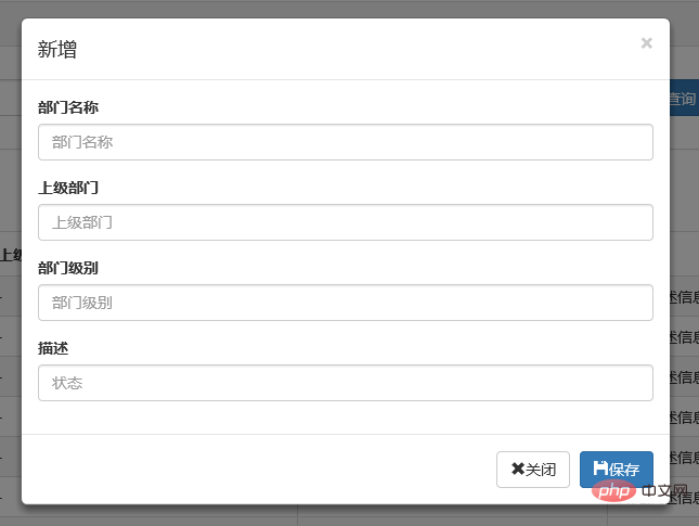
$('#myModal').modal();3、效果展示
新增效果
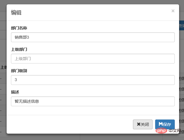
編輯效果
4、說明
彈出框顯示後,點選介面上其他地方以及按Esc鍵都能隱藏彈出框,這樣使得使用者的操作更加友好。關於dialog裡面關閉和儲存按鈕的事件的初始化在專案裡面一般是封裝過的,這個我們待會來看。
二、確認取消提示框
這種型別的提示框一般用於某些需要使用者確定才能進行的操作,比較常見的如:刪除操作、提交訂單操作等。
1、使用bootstrap彈出框確認取消提示框
介紹這個元件之前,就得說說元件封裝了,我們知道,像彈出框、確認取消提示框、資訊提示框這些東西專案裡面肯定是多處都要呼叫的,所以我們肯定是要封裝元件的。下面就來看看我們封裝的缺乏取消提示框。
(function ($) {
window.Ewin = function () {
var html = '<div id="[Id]" class="modal fade" role="dialog" aria-labelledby="modalLabel">' +
'<div class="modal-dialog modal-sm">' +
'<div class="modal-content">' +
'<div class="modal-header">' +
'<button type="button" class="close" data-dismiss="modal"><span aria-hidden="true">×</span><span class="sr-only">Close</span></button>' +
'<h4 class="modal-title" id="modalLabel">[Title]</h4>' +
'</div>' +
'<div class="modal-body">' +
'<p>[Message]</p>' +
'</div>' +
'<div class="modal-footer">' +
'<button type="button" class="btn btn-default cancel" data-dismiss="modal">[BtnCancel]</button>' +
'<button type="button" class="btn btn-primary ok" data-dismiss="modal">[BtnOk]</button>' +
'</div>' +
'</div>' +
'</div>' +
'</div>';
var dialogdHtml = '<div id="[Id]" class="modal fade" role="dialog" aria-labelledby="modalLabel">' +
'<div class="modal-dialog">' +
'<div class="modal-content">' +
'<div class="modal-header">' +
'<button type="button" class="close" data-dismiss="modal"><span aria-hidden="true">×</span><span class="sr-only">Close</span></button>' +
'<h4 class="modal-title" id="modalLabel">[Title]</h4>' +
'</div>' +
'<div class="modal-body">' +
'</div>' +
'</div>' +
'</div>' +
'</div>';
var reg = new RegExp("\\[([^\\[\\]]*?)\\]", 'igm');
var generateId = function () {
var date = new Date();
return 'mdl' + date.valueOf();
}
var init = function (options) {
options = $.extend({}, {
title: "操作提示",
message: "提示內容",
btnok: "確定",
btncl: "取消",
width: 200,
auto: false
}, options || {});
var modalId = generateId();
var content = html.replace(reg, function (node, key) {
return {
Id: modalId,
Title: options.title,
Message: options.message,
BtnOk: options.btnok,
BtnCancel: options.btncl
}[key];
});
$('body').append(content);
$('#' + modalId).modal({
width: options.width,
backdrop: 'static'
});
$('#' + modalId).on('hide.bs.modal', function (e) {
$('body').find('#' + modalId).remove();
});
return modalId;
}
return {
alert: function (options) {
if (typeof options == 'string') {
options = {
message: options
};
}
var id = init(options);
var modal = $('#' + id);
modal.find('.ok').removeClass('btn-success').addClass('btn-primary');
modal.find('.cancel').hide();
return {
id: id,
on: function (callback) {
if (callback && callback instanceof Function) {
modal.find('.ok').click(function () { callback(true); });
}
},
hide: function (callback) {
if (callback && callback instanceof Function) {
modal.on('hide.bs.modal', function (e) {
callback(e);
});
}
}
};
},
confirm: function (options) {
var id = init(options);
var modal = $('#' + id);
modal.find('.ok').removeClass('btn-primary').addClass('btn-success');
modal.find('.cancel').show();
return {
id: id,
on: function (callback) {
if (callback && callback instanceof Function) {
modal.find('.ok').click(function () { callback(true); });
modal.find('.cancel').click(function () { callback(false); });
}
},
hide: function (callback) {
if (callback && callback instanceof Function) {
modal.on('hide.bs.modal', function (e) {
callback(e);
});
}
}
};
},
dialog: function (options) {
options = $.extend({}, {
title: 'title',
url: '',
width: 800,
height: 550,
onReady: function () { },
onShown: function (e) { }
}, options || {});
var modalId = generateId();
var content = dialogdHtml.replace(reg, function (node, key) {
return {
Id: modalId,
Title: options.title
}[key];
});
$('body').append(content);
var target = $('#' + modalId);
target.find('.modal-body').load(options.url);
if (options.onReady())
options.onReady.call(target);
target.modal();
target.on('shown.bs.modal', function (e) {
if (options.onReady(e))
options.onReady.call(target, e);
});
target.on('hide.bs.modal', function (e) {
$('body').find(target).remove();
});
}
}
}();
})(jQuery);
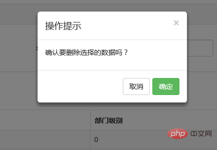
元件封裝不瞭解元件封裝的朋友可以先看看相關文章。這裡我們的確認取消提示框主要用到了confirm這個屬性對應的方法。還是來看看如何呼叫吧:
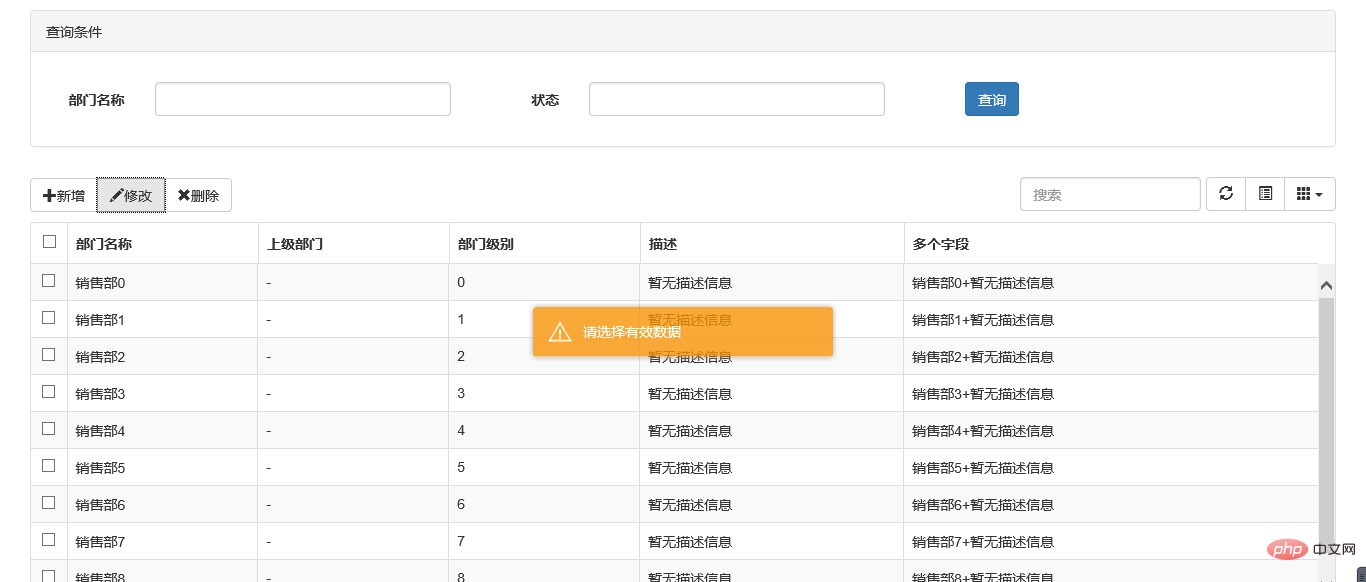
//註冊刪除按鈕的事件
 $("#btn_delete").click(function () {
            //取表格的選中行資料
            var arrselections = $("#tb_departments").bootstrapTable('getSelections');
            if (arrselections.length <= 0) {
                toastr.warning('請選擇有效資料');
                return;
            }

            Ewin.confirm({ message: "確認要刪除選擇的資料嗎?" }).on(function (e) {
                if (!e) {
                    return;
                }
                $.ajax({
                    type: "post",
                    url: "/api/DepartmentApi/Delete",
                    data: { "": JSON.stringify(arrselections) },
                    success: function (data, status) {
                        if (status == "success") {
                            toastr.success('提交資料成功');
                            $("#tb_departments").bootstrapTable('refresh');
                        }
                    },
                    error: function () {
                        toastr.error('Error');
                    },
                    complete: function () {

                    }

                });
            });
        });
message屬性傳入提示的資訊,on裡面注入點選按鈕後的回撥事件。
生成的效果:
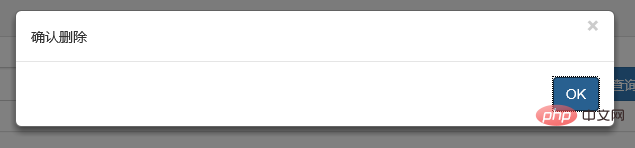
2、bootbox元件的使用
在網上找bootstrap的彈出元件時總是可以看到bootbox這麼一個東西,確實是一個很簡單的元件,還是來看看如何使用吧。
bootbox API:http://bootboxjs.com/documentation.html
當然要使用它必須要新增元件嘍。無非也是兩種方式:引入原始碼和Nuget。
接下來就是使用它了。首先當然是新增bootbox.js的參照了。然後就是在相應的地方呼叫了。
$("#btn_delete").click(function () {
var arrselections = $("#tb_departments").bootstrapTable('getSelections');
if (arrselections.length <= 0) {
toastr.warning('請選擇有效資料');
return;
}
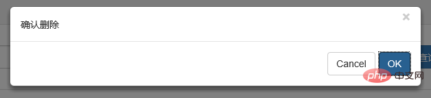
bootbox.alert("確認刪除", function () {
var strResult = "";
})
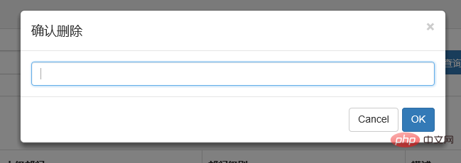
bootbox.prompt("確認刪除", function (result) {
var strResult = result;
})
bootbox.confirm("確認刪除", function (result) {
var strResult = result;
})
});效果展示:
更多用法可以參見api。使用起來基本很簡單。這個元件最大的特點就是和bootstrap的風格能夠很好的保持一致。
3、在網上還找到一個效果比較炫一點的提示框:sweetalert
要使用它,還是老規矩:Nuget。
(1)檔案
sweetalert Api:http://t4t5.github.io/sweetalert/
開源專案原始碼:https://github.com/t4t5/sweetalert
(2)在cshtml頁面引入js和css
<link href="~/Styles/sweetalert.css" rel="stylesheet" />
<script src="~/Scripts/sweetalert.min.js"></script>
(3)js使用
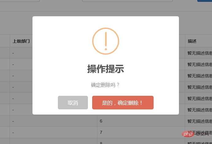
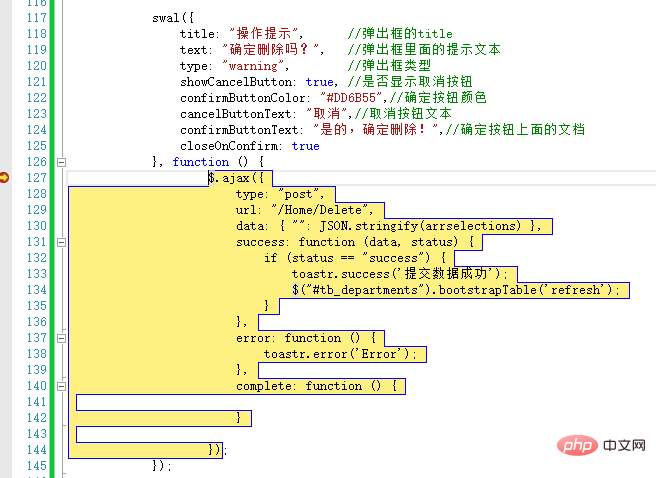
swal({
                title: "操作提示",      //彈出框的title
                text: "確定刪除嗎?",   //彈出框裡面的提示文字
                type: "warning",        //彈出框型別
                showCancelButton: true, //是否顯示取消按鈕
                confirmButtonColor: "#DD6B55",//確定按鈕顏色
                cancelButtonText: "取消",//取消按鈕文字
                confirmButtonText: "是的,確定刪除!",//確定按鈕上面的檔案
                closeOnConfirm: true
            }, function () {
                    $.ajax({
                        type: "post",
                        url: "/Home/Delete",
                        data: { "": JSON.stringify(arrselections) },
                        success: function (data, status) {
                            if (status == "success") {
                                toastr.success('提交資料成功');
                                $("#tb_departments").bootstrapTable('refresh');
                            }
                        },
                        error: function () {
                            toastr.error('Error');
                        },
                        complete: function () {

                        }

                    });
            });
(4)效果展示:
點選確定後進入回撥函數:
元件很多,用哪種園友沒可以自行決定,不過博主覺得像一些網際網路、電子商務型別的網站用sweetalert效果比較合適,一般的內部系統可能也用不上。
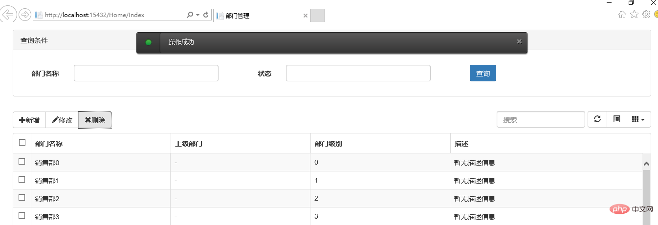
三、操作完成提示框
1、toastr.js元件
關於資訊提示框,博主專案中使用的是toastr.js這麼一個元件,這個元件最大的好處就是非同步、無阻塞,提示後可設定消失時間,並且可以將訊息提示放到介面的各個地方。先來看看效果。
官方檔案以及原始碼
原始碼網站:http://codeseven.github.io/toastr/
api:http://www.ithao123.cn/content-2414918.html
關於它的使用。
(1)、引入js和css
<link href="~/Content/toastr/toastr.css" rel="stylesheet" />
<script src="~/Content/toastr/toastr.min.js"></script>
(2)、js初始化
<script type="text/javascript">
        toastr.options.positionClass = 'toast-bottom-right';
</script>
將這個屬性值設定為不同的值就能讓提示資訊顯示在不同的位置,如toast-bottom-right表示下右、toast-bottom-center表示下中、toast-top-center表示上中等,更過位置資訊請檢視檔案。
(3)、使用
//初始化編輯按鈕
$("#btn_edit").click(function () {
     var arrselections = $("#tb_departments").bootstrapTable('getSelections');
     if (arrselections.length > 1) {
        toastr.warning('只能選擇一行進行編輯');

        return;
     }
     if (arrselections.length <= 0) {
        toastr.warning('請選擇有效資料');

       return;
    }

    $('#myModal').modal();
});
使用起來就如下一句:
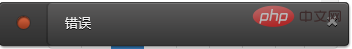
toastr.warning('只能選擇一行進行編輯');是不是很簡單~~這裡的有四種方法分別對應四種不同顏色的提示框。
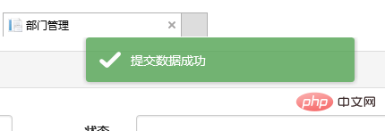
toastr.success('提交資料成功');
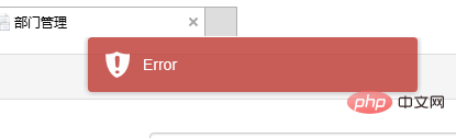
toastr.error('Error');
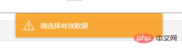
toastr.warning('只能選擇一行進行編輯');
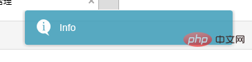
toastr.info('info');分別對應上圖中的四種顏色的提示框。
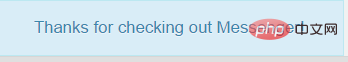
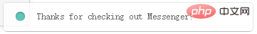
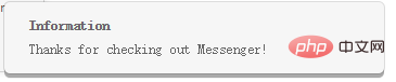
2、Messenger元件
在Bootstrap中文網裡面提到了一個alert元件:Messenger。
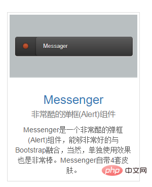
它的使用和toastr.js這個元件基本相似,只不過效果有點不太一樣。我們還是來看看它是如何使用的。
(1)效果展示
可以定位到網頁的不同位置,例如下圖中給出的下中位置、上中位置。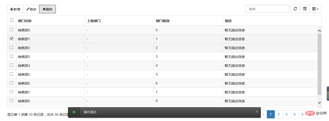
提示框的樣式有三種狀態:Success、Error、Info
並且支援四種不同樣式的提示框:Future、Block、Air、Ice

(2)元件使用以及程式碼範例
Messenger Api檔案:http://www.bootcss.com/p/messenger/
Messenger 原始碼:https://github.com/HubSpot/messenger
關於它的使用和toastr大同小異,首先引入元件:
<script src="~/Content/HubSpot-messenger-a3df9a6/build/js/messenger.js"></script>
<link href="~/Content/HubSpot-messenger-a3df9a6/build/css/messenger.css" rel="stylesheet" />
<link href="~/Content/HubSpot-messenger-a3df9a6/build/css/messenger-theme-future.css" rel="stylesheet" />
初始化它的位置
<script type="text/javascript">
         $._messengerDefaults = {
             extraClasses: 'messenger-fixed messenger-theme-future messenger-on-bottom messenger-on-right'
       }
</script>
然後js裡面使用如下:
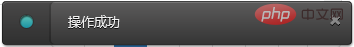
$("#btn_delete").click(function () {
            $.globalMessenger().post({
                message: "操作成功",//提示資訊
                type: 'info',//訊息型別。error、info、success
                hideAfter: 2,//多長時間消失
                showCloseButton:true,//是否顯示關閉按鈕
                hideOnNavigate: true //是否隱藏導航
        });
 });
如果提示框使用預設樣式,也只有一句就能解決
$.globalMessenger().post({
       message: "操作成功",//提示資訊
       type: 'info',//訊息型別。error、info、success
});
很簡單很強大有木有~~
四、總結
以上就是博主花了幾個小時時間整理出來的幾種常用bootstrap常用彈出和提示框的效果以及使用小結,雖然花了點時間,但想想值了。如果你覺得文章能或多或少幫到你,請幫忙推薦一下吧,畢竟有你的支援,博主才有更大的動力。另外,如果園友們有什麼更好的的彈出提示元件,不吝賜教~~歡迎拍磚~~
鑑於園友提的一個問題,博主將toastr元件加了一個居中顯示的效果,其實也很簡單,在此記錄下:
在toastr.css檔案中加一個樣式:
.toast-center-center {
   top: 50%;
   left: 50%;
   margin-top: -25px;
   margin-left: -150px;
}
然後在指定位置的時候
<script type="text/javascript">
         toastr.options.positionClass = 'toast-center-center';
</script>
搞定,然後看看效果:
更多程式設計相關知識,請存取:!!
以上就是淺談Bootstrap中的彈出框和提示框(程式碼範例)的詳細內容,更多請關注TW511.COM其它相關文章!