bootstrap實現簡單側邊導航欄效果

相關推薦:《》
bootstrap側邊導航欄實現原理
側滑欄使用定位fixed
使用bootstrap響應式使用工具類 visible-sm visible-xs hidden-xs hidden-sm等對不同螢幕適配
側滑欄的側滑效果不使用jquery方法來實現,使用的是css3 transforms屬性進行div的移動,側滑的動畫效果使用的是css屬性transition
缺點:使用兩套選單,一套是pc端螢幕顯示的選單,一套是行動端顯示的手機導航選單,這個缺點比較明顯,生成無關的標籤,優點程式碼少,簡單容易接受
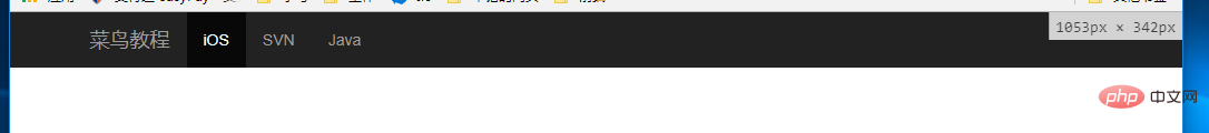
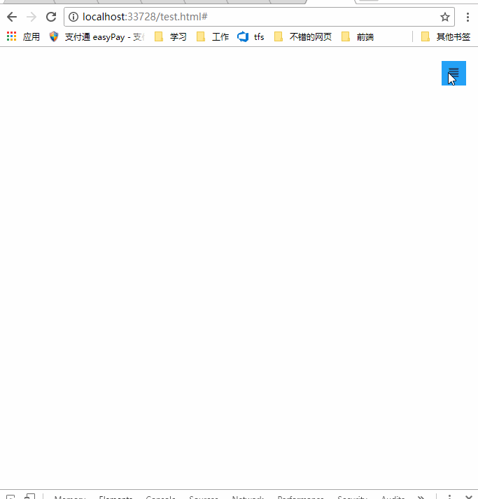
效果圖
bootstrap導航欄佈局
    <!--手機導航欄-->
    <div id="mobile-menu" class="mobile-nav visible-xs visible-sm">
        <ul>
            <li><a href="#">首頁</a></li>
            <li><a href="#">Java</a></li>
            <li><a href="#">SVN</a></li>
            <li><a href="#">iOS</a></li>
        </ul>
    </div>
    <!--pc導航欄-->
    <nav class="navbar-inverse visible-lg visible-md" role="navigation">
        <div class="container">
            <div class="navbar-header">
                <a class="navbar-brand" href="#">菜鳥教學</a>
            </div>
            <div>
                <ul class="nav navbar-nav">
                    <li class="active"><a href="#">iOS</a></li>
                    <li><a href="#">SVN</a></li>
                    <li><a href="#" class="dropdown-toggle" data-toggle="dropdown">Java</a></li>
                </ul>
            </div>
        </div>
    </nav>
    <!--手機導航欄側滑-->
    <div class="nav-btn visible-xs visible-sm">
        <a href="#" class="mobile-nav-taggle" id="mobile-nav-taggle">
            <span class="glyphicon glyphicon-align-justify"></span>
        </a>
    </div>
一個導航欄的佈局,用了兩個導航選單,一個是pc端的,一個是手機端,利用bootstrap響應式使用工具類visible-xs visible-sm來實現pc端隱藏切換按鈕; visible-lg visible-md 實現了pc端顯示導航欄;visible-xs visible-sm實現手機端顯示手機導航欄。
bootstrap響應式工具類詳見:https://www.runoob.com/bootstrap/bootstrap-responsive-utilities.html
css實現佈局和側滑效果(側滑的關鍵css3屬性transform、transition)
程式碼不多,僅僅10行
         * {margin:0;padding:0;}
         #mobile-menu {position:fixed;top:0;left:0;width:220px;height:100%;background-color:#373737;z-index:9999;}
         a:hover ,a:focus{text-decoration:none}
        .mobile-nav ul li a {color:gray;display:block;padding:1em 5%;    border-top:1px solid #4f4f4f;border-bottom:1px solid #292929;transition:all 0.2s ease-out;cursor:pointer;#mobile-menu {position:fixed;top:0;left:0;width:220px;height:100%;background-color:#373737;z-index:9999;transition:all 0.3s ease-in;}}
        .mobile-nav ul li a:hover {background-color: #23A1F6;color: #ffffff;}
        .show-nav {transform:translateX(0);}
        .hide-nav {transform:translateX(-220px);} /*側滑關鍵*/
        .mobile-nav-taggle {height:35px;line-height:35px;width:35px;background-color:#23A1F6;color:#ffffff;display:inline-block;text-align:center;cursor:pointer}
        .nav.avbar-inverse{position:relative;}
        .nav-btn {position:absolute;right:20px;top:20px;}
要值得注意的是css3的兩個屬性:
transform:旋轉div,支援元素2D或3D旋轉,屬性值translateX(X)就是在X軸上移動Xpx的距離
http://www.w3school.com.cn/cssref/pr_transform.asp
而側滑的動畫效果是使用transition屬性,設定屬性的過渡動畫的效果,語法
transition: property duration timing-function delay;
http://www.w3school.com.cn/cssref/pr_transition.asp
單擊事件切換側滑
        $("#mobile-nav-taggle").click(function () {
            var mobileMenu = $("#mobile-menu");
            if (mobileMenu.hasClass("show-nav")) {
                setTimeout(function () {
                    mobileMenu.addClass("hide-nav").removeClass("show-nav");
                }, 100)
            }
            else {
                setTimeout(function (){
                    mobileMenu.addClass("show-nav").removeClass("hide-nav");
                }, 100)
            }
        })
總結
不推薦用兩個選單導航欄,缺點很明顯,為了實現效果而已,不要介意,其實用一個選單導航欄也是可以實現,試試media 完全可以實現。
程式碼下載:http://download.csdn.net/detail/kebi007/9909725
更多程式設計相關知識,請存取:!!
以上就是bootstrap實現簡單側邊導航欄效果的詳細內容,更多請關注TW511.COM其它相關文章!