淺談Bootstrap中的垂直水平居中
2021-01-04 21:00:29
相關教學推薦:《》
Bootstrap水平居中
// 文字:

class ="text-center"
// 圖片居中:

class = "center-block"
//其他元素:

//bootstrap3水平居中:利用bootstrap列偏移

class = "col-md-offset-4 col-lg-offset-4col-xl-offset-4"
// bootstrap4水平居中:

class = "m-auto"
Bootstrap垂直居中
bootstrap3 如何讓div內部垂直居中:
Bootstrap的柵格系統使用的是float:left的浮動方式,vertical-align屬性不起作用,故把內部div的float屬性清除,新增display屬性,如下:
.middle {
float: none;
display: inline-block;
vertical-align: middle;
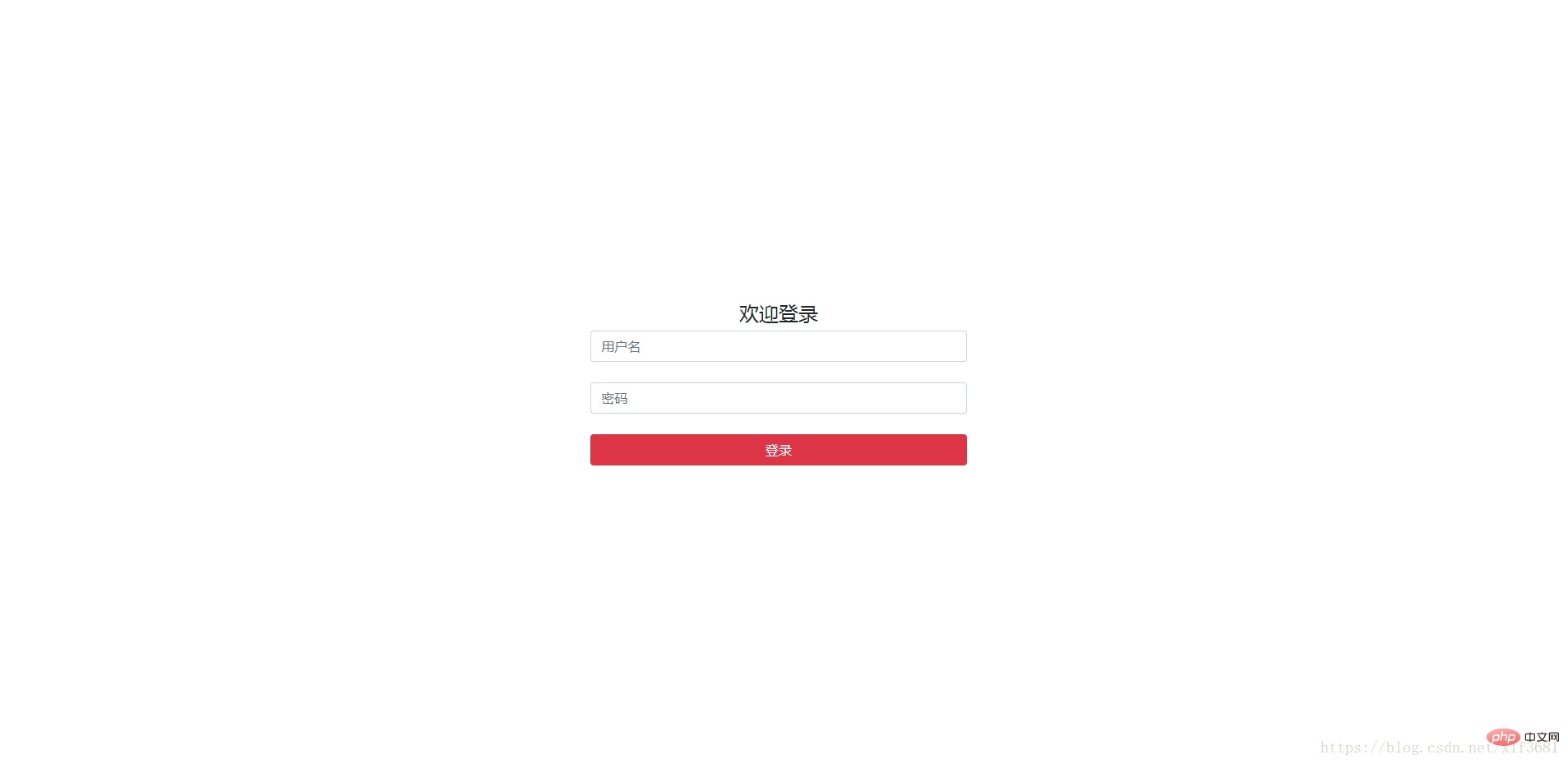
}Bootstrap3登入框自適應水平居中+垂直居中
https://blog.csdn.net/shenzhen_zsw/article/details/75331515
Bootstrap4 如何讓div內部垂直居中:
給元素定高度
.login-center {

 height: 100vh;

}
應用.align-items-center可以使元素垂直居中:
<div class="row align-items-centerjustify-content-center login-center">

…

</div>
應用. justify-content-center可以使元素水平居中:
效果:
更多程式設計相關知識,請存取:!!
以上就是淺談Bootstrap中的垂直水平居中的詳細內容,更多請關注TW511.COM其它相關文章!