LiarTrump字母翻轉——CSS3前端小動畫
LiarTrump字母翻轉——CSS3前端小動畫
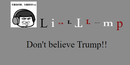
效果展示
LiarTrump
模板下載地址
1.說明
模板我上傳到CSDN資源了,不需要積分就可以下載的,大家隨便去,模板把html,css分開了,好歹標準些,別從我這直接複製,很醜,哈哈,符合規範一些,去下載一個,再次宣告不要積分的(發生了點兒我不知道的情況,沒傳過資源,不知道為什麼,我設定的是0積分,可是他自己漲上去了…)。😀😀😀😀
2.LiarTrump字母翻轉下載
程式碼實現
這整段程式碼都寫在了html裡,是為了讓大家複製並且自己演示一下,但是千萬不要直接用(你們也可以自己分開,很容易的- -),太不正規了,想要資源的去上面連結下載,不要積分的😏😏😏😏
之所以先扔個程式碼,主要是有人他就是來看程式碼的,基礎知識、涉及到的點不需要看,哈哈,關於每行怎麼寫的詳細的分析我會在後面寫,儘量把每個人當作小白,讓你們搞懂這段程式碼💪💪💪💪
1.LiarTrump翻轉字母
<!DOCTYPE html>
<html lang="en">
<head>
    <meta charset="UTF-8">
    <title>g55zhw_CSS3</title>
    <style>
        body {
            background-color: #8C8C8C;
            text-align: center;
        }

        .words {
            font-size: 50px;
            font-family: "Times New Roman", sans-serif;
        }

        .words > span {
            display: inline-block;
            animation: method 3s infinite linear;
        }

        @keyframes method {
            50% {
                transform: rotateX(360deg);
            }
            100% {
                transform: rotateX(360deg);
            }
        }

        .words > span:nth-child(3n + 0) {
            color: white;
        }

        .words > span:nth-child(3n + 1) {
            color: #8B0000;
        }

        .words > span:nth-child(1) {
            animation-delay: 0.2s;
        }

        .words > span:nth-child(2) {
            animation-delay: 0.4s;
        }

        .words > span:nth-child(3) {
            animation-delay: 0.6s;
        }

        .words > span:nth-child(4) {
            animation-delay: 0.8s;
        }

        .words > span:nth-child(5) {
            animation-delay: 1.0s;
        }

        .words > span:nth-child(6) {
            animation-delay: 1.2s
        }

        .words > span:nth-child(7) {
            animation-delay: 1.4s
        }

        .words > span:nth-child(8) {
            animation-delay: 1.6s
        }

        .words > span:nth-child(9) {
            animation-delay: 1.8s
        }

        .words > span:nth-child(10) {
            animation-delay: 2s
        }

    </style>
</head>
<body>
<div>
    <div class="words">
        <span><img src="bug.jpg" alt="not found" width="100" height="100"/></span>
        <span>L</span>
        <span>i</span>
        <span>a</span>
        <span>r</span>
        <span>T</span>
        <span>r</span>
        <span>u</span>
        <span>m</span>
        <span>p</span>
    </div>
    <p>Don't believe Trump!!</p>
</div>

</body>
</html>
相關方法的介紹
這裡我會向大家介紹上面一些方法的使用,主要物件是和我差不多的小白😂😂😂,所以高手請自動忽略(ps:這一篇非常非常基礎,大家理解為假期完了來湊數的吧,哈哈哈),不過說錯的地方依舊需要指點的,請在評論區批評指正,謝謝。
1.style標籤
    <style>
        body {
            background-color: #8C8C8C;
            text-align: center;
        }

        .words {
            font-size: 50px;
            font-family: "Times New Roman", sans-serif;
        }

        .words > span {
            display: inline-block;
            animation: method 3s infinite linear;
        }

        @keyframes method {
            50% {
                transform: rotateX(360deg);
            }
            100% {
                transform: rotateX(360deg);
            }
        }

        .words > span:nth-child(3n + 0) {
            color: white;
        }

        .words > span:nth-child(3n + 1) {
            color: #8B0000;
        }

        .words > span:nth-child(1) {
            animation-delay: 0.2s;
        }

        .words > span:nth-child(2) {
            animation-delay: 0.4s;
        }

        .words > span:nth-child(3) {
            animation-delay: 0.6s;
        }

        .words > span:nth-child(4) {
            animation-delay: 0.8s;
        }

        .words > span:nth-child(5) {
            animation-delay: 1.0s;
        }

        .words > span:nth-child(6) {
            animation-delay: 1.2s
        }

        .words > span:nth-child(7) {
            animation-delay: 1.4s
        }

        .words > span:nth-child(8) {
            animation-delay: 1.6s
        }

        .words > span:nth-child(9) {
            animation-delay: 1.8s
        }

        .words > span:nth-child(10) {
            animation-delay: 2s
        }
    </style>
這一段是本篇程式碼的核心(除了這個也沒其他的東西了- -|||),在一般的html頁面裡,大家是不會見到這一段的,我也主要是為了看著方便,給寫在一起了,一般情況是需要將這些設定放在css裡,然後通過這段程式碼引入的:
<link rel="stylesheet" href="../css/style.css">
style標籤裡面規定了很多很多的屬性,感興趣的可以自己去查一查,我這裡主要介紹一下我使用的屬性(由於屬性不多,所以我得水一水,無論啥屬性,都拿上來說一說,美其名曰:「詳細」!!!😀😀😀)。
2.選擇器
    <style>
        body {
        }

        .words {
        }

        .words > span {
        }

        .words > span:nth-child(***) {
        }
    </style>
const 這裡面我主要用了這四種選擇器。
| 序號 | 選擇器 | 應用 | 說明 | 備註 |
|---|---|---|---|---|
| ① | element | body | 選擇所有<body>元素 | |
| ② | .class | .words | 選擇所有class="words"的元素 | |
| ③ | element>element | .words > span | 選擇所有父級是 class=「words」 元素的 <span> 元素 | 例:div>p 選擇所有父級是 <div> 元素的 <p> 元素 |
| ④ | :nth-child(n) | .words > span:nth-child(1) | 選擇每個(所有父級是 class=「words」 元素的 <span> 元素)的元素是其父級的第一個子元素 | 例:p:nth-child(1) 選擇每個p元素是其父級的第一個子元素 |
3.@keyframes 規則
    <style>
        @keyframes flip {
            100% {
                transform: rotateX(360deg);
            }
        }
    </style>
keyframes可以建立一些簡單的動畫,這些動畫只需要CSS就可以完成,缺點就是太過單調,不過在某些時候還是挺好用的。
建立動畫是通過逐步改變從一個CSS樣式設定到另一個。在動畫過程中,可以更改CSS樣式的設定多次。指定的變化時發生時使用%,或關鍵字"from"和"to",這是和0%到100%相同。0%是開頭動畫,100%是當動畫完成。
比如我這兒就是隻插入了一個關鍵幀,100%,即是限定了結束那一幀的狀態。
還有一些其他的方法,稍微基礎點兒的比如有移動,給大家舉個例子:
<!DOCTYPE html>
<html lang="en">
<head>
    <meta charset="UTF-8">
    <title>g55zhw_CSS3</title>
    <style>
        body {
            background-color: white;
        }

        .huaji > span {
            animation:method 6s infinite;
            position:relative;
        }

        @keyframes method {
            0%   {top:400px;left:400px;}
            10%  {top:100px;left:100px;}
            20%  {top:100px;left:700px;}
            30%  {top:700px;left:700px;}
            40%  {top:700px;left:100px;}
            50%  {top:200px;left:200px;}
            60%  {top:200px;left:600px;}
            70%  {top:600px;left:600px;}
            80%  {top:600px;left:200px;}
            90%  {top:400px;left:800px;}
            100% {top:400px;left:400px;}
        }
    </style>
</head>
<body>
<div>
    <div class="huaji">
        <span><img src="huaji.jpg" alt="not found" width="100" height="100"/></span>
    </div>
</div>
</body>
</html>
效果:

4.animation-delay
animation-delay 屬性定義動畫什麼時候開始;animation-delay 值單位可以是秒(s)或毫秒(ms)。
比如我如果設定上面的滑稽臉延遲時間是-2秒,那麼我們立刻就能看到他開始動,並且是從他的2秒的位置開始的。
尾聲
通過這些,大家應該能夠徹底理解這些程式碼了,我相信也能自己寫出來一份了,俗話說的好,授人以魚不如授人以漁,我這是魚給了,網子也給了,還告訴你們哪裡有魚了,同時也希望大家能告訴我我這個網子哪裡破了(寫的不好的地方),或者也能分享點兒打魚方法上來,不勝感激!!請不吝賜教😝😝😝😝