我的Vue之旅、01 深入Flexbox佈局完全指南
花了幾個小時整合的"A Complete Guide to Flexbox"最新版本,介紹了flexbox的所有屬性,外帶幾個實用的例子。
傳統佈局、Flexbox
佈局的傳統解決方案,基於盒狀模型,依賴 display、position、float 三大屬性。它對於那些特殊佈局非常不方便,比如,垂直居中就不容易實現。
Flex佈局,可以簡便、完整、響應式地實現各種頁面佈局。目前,它已經得到了所有瀏覽器的支援,這意味著,現在就能很安全地使用這項功能。
Flex是Flexible Box的縮寫,意為」彈性佈局」,用來為盒狀模型提供最大的靈活性。任何一個容器都可以指定為Flex佈局。
背景
Flexbox提供了一種有效的方式來對容器內的元素佈局、對齊、分配空間。能在不知道子元素大小或動態變化情況下分配好各個子元素間的間隙。(正如其名flex)
Flex佈局的主要思想是給父元素動態調整子元素的高度寬度的能力,使各元素適應可用佈局空間。(能夠適應不同的裝置和不同大小的螢幕),一個flex容器可以放大子元素來填充可用空間,也可以縮小子元素來防止溢位。
最重要的是,與常規佈局相比(垂直的塊佈局和水平的內聯佈局)Flexbox佈局是方向未知的。傳統佈局對大型複雜應用的靈活性不是很好(特別是在改變方向,大小,伸展,收縮方面)
注:Flexbox佈局適合應用元件或小規模的佈局。Grid佈局適合大規模的佈局。
基本概念
Flex佈局是一個完整的模組而不是一個單獨的屬性,它包括了完整的一套屬性。其中有的屬性是設定在容器(container,也可以叫做父元素,稱為flex container)上,有的則是設定在容器的專案上(item,也可以叫做子元素,稱為flex items)上。
如果我們可以說傳統佈局是建立在塊狀元素垂直流和行內元素水平流上的,那麼flex佈局就是建立在」flex-flow方向」上的,通過下圖解釋flex佈局的主要思想。

在flex佈局中,子元素要麼按照主軸也就是main axis(從main-start到main-end)排布,要麼按照交叉軸,也就是cross axis(從cross-start到cross-end)排布。
- main axis: Flex 父元素的主軸是指子元素佈局的主要方向軸,注意主軸不一定是水平的,它由屬性
flex-direction來確定主軸是水平還是垂直的。 - main-start|main-end: 分別表示主軸的開始和結束,子元素在父元素中會沿著主軸從main-start到main-end排布。
- main size: 子元素在主軸方向上的大小。包括長度和寬度。
- cross axis: 交叉軸,與主軸垂直。
- cross-start|cross-end: 分別表示交叉軸的開始和結束。子元素在交叉軸的排布從cross-start開始到cross-end。
- cross size: 子元素在交叉軸方向上的大小。包括長度和寬度。
屬性介紹
.container 是設定在容器上的,.item 是設定在子元素上的。
display 設定佈局容器

<div class="parent">
<span class="child">水平垂直居中</span>
</div>
.parent {
  display: flex;
  height: 300px;
  border: 1px solid;
}

.child {
  width: 100px;
  height: 100px;
  line-height: 100px;
  margin: auto;
  border: 1px solid;
}
給子元素設定 margin 為 auto,可以吸收額外的空間。使元素在兩個軸上完美居中。
響應式初體驗
考慮有6個子元素,有固定的大小,希望能夠在改變瀏覽器寬度的時候仍然可以在水平軸上完美地顯示。
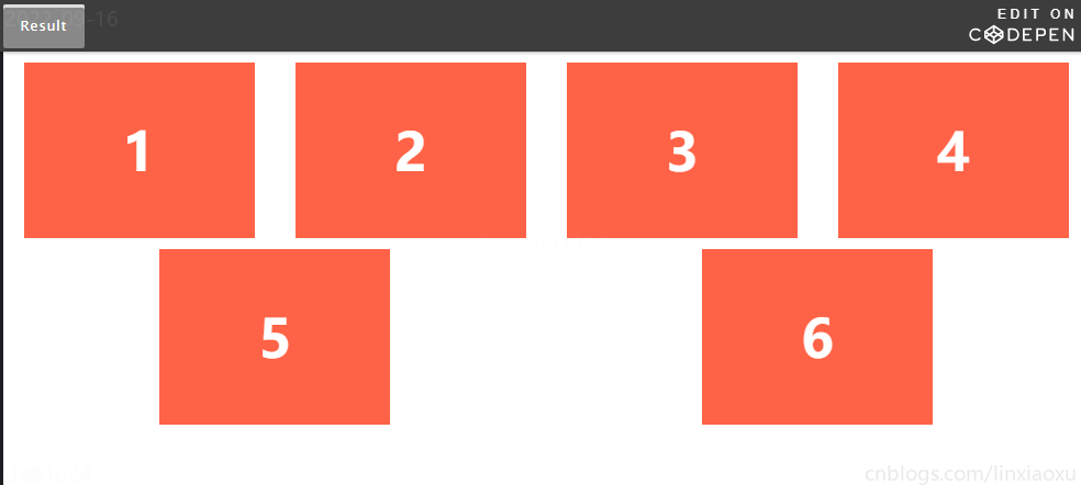
<ul class="flex-container">
  <li class="flex-item">1</li>
  <li class="flex-item">2</li>
  <li class="flex-item">3</li>
  <li class="flex-item">4</li>
  <li class="flex-item">5</li>
  <li class="flex-item">6</li>
</ul>
.flex-container {
  /* 設定flex容器 */
  display: flex;

  /* Then we define the flow direction
     and if we allow the items to wrap
   * Remember this is the same as:
   * flex-direction: row;
   * flex-wrap: wrap;
   */
  flex-flow: row wrap;

  /* Then we define how is distributed the remaining space */
  justify-content: space-around;

  padding: 0;
  margin: 0;
  list-style: none;
}

.flex-item {
  background: tomato;
  padding: 5px;
  width: 200px;
  height: 150px;
  margin-top: 10px;
  line-height: 150px;
  color: white;
  font-weight: bold;
  font-size: 3em;
  text-align: center;
}
https://codepen.io/css-tricks/embed/EKEYob
響應式導航欄
一個向右對齊的導航欄在網頁的最上端,我們希望它在中屏上顯示時為居中,在小屏上以單列顯示。
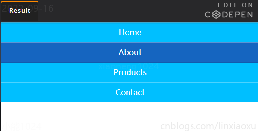
<ul class="navigation">
  <li><a href="#">Home</a></li>
  <li><a href="#">About</a></li>
  <li><a href="#">Products</a></li>
  <li><a href="#">Contact</a></li>
</ul>
.navigation {
  display: flex;
  flex-flow: row wrap;
  justify-content: flex-end;

  list-style: none;
  margin: 0;
  background: deepskyblue;
}

.navigation a {
  text-decoration: none;
  display: block; /* 變成塊級元素撐起整個navigation */
  padding: 1em;
  color: white;
}

.navigation a:hover {
  background: #1565C0;
}

/* 往中屏切換 */
@media all and (max-width: 800px) {
  .navigation {
    justify-content: space-around;
  }
}

/* 往小屏切換 */
@media all and (max-width: 600px) {
  .navigation {
    flex-flow: column wrap;
    padding: 0;
  }
  .navigation a {
    text-align: center;
    padding: 10px;
    border-top: 1px solid rgba(255, 255, 255,0.3);
    border-bottom: 1px solid rgba(0, 0, 0, 0.1);
  }
  .navigation li:last-of-type a {
    border-bottom: none;
  }
}
https://codepen.io/css-tricks/embed/YqaKYR
網頁結構佈局
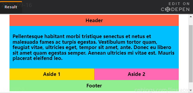
<div class="wrapper">
  <header class="header">Header</header>
  <article class="main">
    <p>Pellentesque habitant morbi tristique senectus et netus et malesuada fames ac turpis egestas. Vestibulum tortor quam, feugiat vitae, ultricies eget, tempor sit amet, ante. Donec eu libero sit amet quam egestas semper. Aenean ultricies mi vitae est. Mauris placerat eleifend leo.</p>
  </article>
  <aside class="aside aside-1">Aside 1</aside>
  <aside class="aside aside-2">Aside 2</aside>
  <footer class="footer">Footer</footer>
</div>
.wrapper {
  display: flex;
  flex-flow: row wrap;
  font-weight: bold;
  text-align: center;
}

.wrapper > * {
  padding: 10px;
  flex: 1 100%;
}

.header {
  background: tomato;
}

.footer {
  background: lightgreen;
}

.main {
  text-align: left;
  background: deepskyblue;
}

.aside-1 {
  background: gold;
}

.aside-2 {
  background: hotpink;
}

@media all and (min-width: 600px) {
  .aside { flex: 1 0 0; }
}

@media all and (min-width: 800px) {
  .main    { flex: 3 0px; }
  .aside-1 { order: 1; }
  .main    { order: 2; }
  .aside-2 { order: 3; }
  .footer  { order: 4; }
}

body {
  padding: 2em;
}
https://codepen.io/anon/embed/vWEMWw
更美觀的標題
使用絕對定位的方式將文字放置在右邊,因為不在檔案流中,無法智慧地決定何時換行。
使用float,在換行時不會有很好的左對齊效果。
使用表格,不會進行換行。
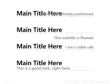
<h3 class="title abs-title">
  <span class="title-main">Main Title Here</span>
  <span class="title-note">This is absolutely positioned.</span>
</h3>

<h3 class="title float-title">
  <span class="title-main">Main Title Here</span>
  <span class="title-note">This subtitle is floated.</span>
</h3>

<h3 class="title table-title">
  <span class="title-main">Main Title Here</span>
  <span class="title-note">I am a table cell.</span>
</h3>

<h3 class="title flex-title">
  <span class="title-main">Main Title Here</span>
  <span class="title-note">This is a good look, right here.</span>
</h3>
body {
  padding: 100px;
  font-size: 21px;
}

.title {
  border-bottom: 1px solid #ccc;
  max-width: 500px;
  margin: 40px auto;
}
.title-note {
  font-size: 60%;
  color: #999;
}

.abs-title {
  position: relative;
  .title-note {
    position: absolute;
    bottom: 2px;
    right: 0;
  }
}

.float-title {
  .title-note {
    float: right;
    position: relative;
    top: 12px;
  }
}

.table-title {
  display: table;
  width: 100%;
  > span {
    display: table-cell;
    white-space: nowrap;
  }
  .title-main {
    width: 99%;
  }
}

.flex-title {
  display: flex;
  align-items: flex-end;
  flex-wrap: wrap;
  > span {
    white-space: nowrap;  /* 強制在同一行內顯示所有文字 */
  }
  .title-main {
    flex-grow: 1;  /* 讓標題利用多餘空間進行擴充套件,從而使副標題緊靠右邊 */
  }
}
https://codepen.io/chriscoyier/embed/doVXLV
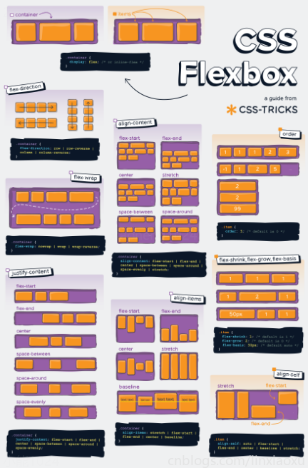
使用海報
參考資料
A Complete Guide to Flexbox | CSS-Tricks - CSS-Tricks