Matplotlib提琴圖
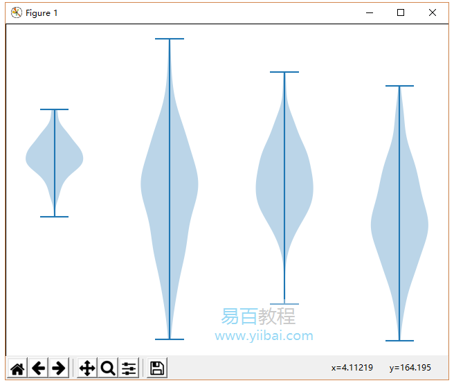
小提琴圖類似於箱形圖,除了它們還顯示不同值的資料的概率密度。這些圖包括資料中位數的標記和表示四分位數範圍的框,如標準框圖中所示。在該箱圖上疊加的是核密度估計。與箱形圖一樣,小提琴圖用於表示跨不同「類別」的可變分布(或樣本分布)的比較。
小提琴圖形比普通圖形更具資訊性。事實上,雖然箱形圖僅顯示平均值/中位數和四分位數範圍等彙總統計量,但小提琴圖顯示了資料的完整分布。
import matplotlib.pyplot as plt

np.random.seed(10)
collectn_1 = np.random.normal(100, 10, 200)
collectn_2 = np.random.normal(80, 30, 200)
collectn_3 = np.random.normal(90, 20, 200)
collectn_4 = np.random.normal(70, 25, 200)

## combine these different collections into a list
data_to_plot = [collectn_1, collectn_2, collectn_3, collectn_4]

# Create a figure instance
fig = plt.figure()

# Create an axes instance
ax = fig.add_axes([0,0,1,1])

# Create the boxplot
bp = ax.violinplot(data_to_plot)
plt.show()
執行上面範例程式碼,得到以下結果: